Use plain language
Plain language is writing that is clear, concise, and well organized and generally understandable to the intended audience the first time they read or hear it (plainlanguage.gov). Plain language is essential to a good UI customer experience. Due to the complexity of program rules and eligibility requirements, claimants often have difficulty understanding application questions, which can cause them to inadvertently provide incorrect answers and contributes to improper payments and spikes in call center call volume. Writing application questions in plain language helps everyone, including (but not limited to) people with disabilities, those with limited English proficiency, and people who are experiencing stress. Learn more in our guide to UI plain language questions and more broadly, our approach to plain language.
Use conditional/ dynamic questions
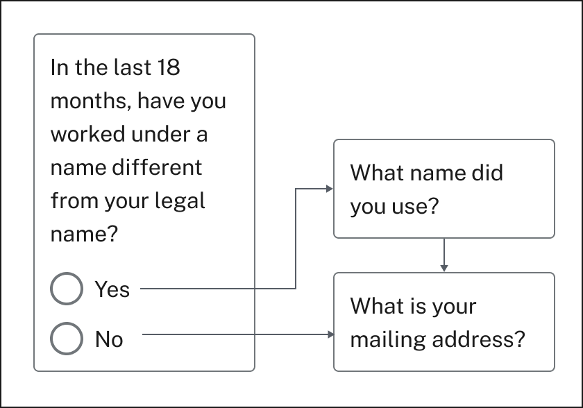
Online applications featuring dynamic (conditional) questions are quicker to complete because claimants only need to answer questions relevant to them. Dynamic questions use simple, low-tech logic to provide follow-up questions conditionally based on a claimant’s answer to a previous multiple-choice question. Though this practice requires design time and testing whenever the application is updated, quality dynamic questions reduce application drop offs and help agencies collect more accurate information.
Showing only relevant questions reduces cognitive load and saves claimants time, yielding a better customer experience. Ultimately conditional/ dynamic questions help claimants submit accurate applications without extraneous information that requires review and can therefore be processed in a timely way by state agencies.
Provide contextual help
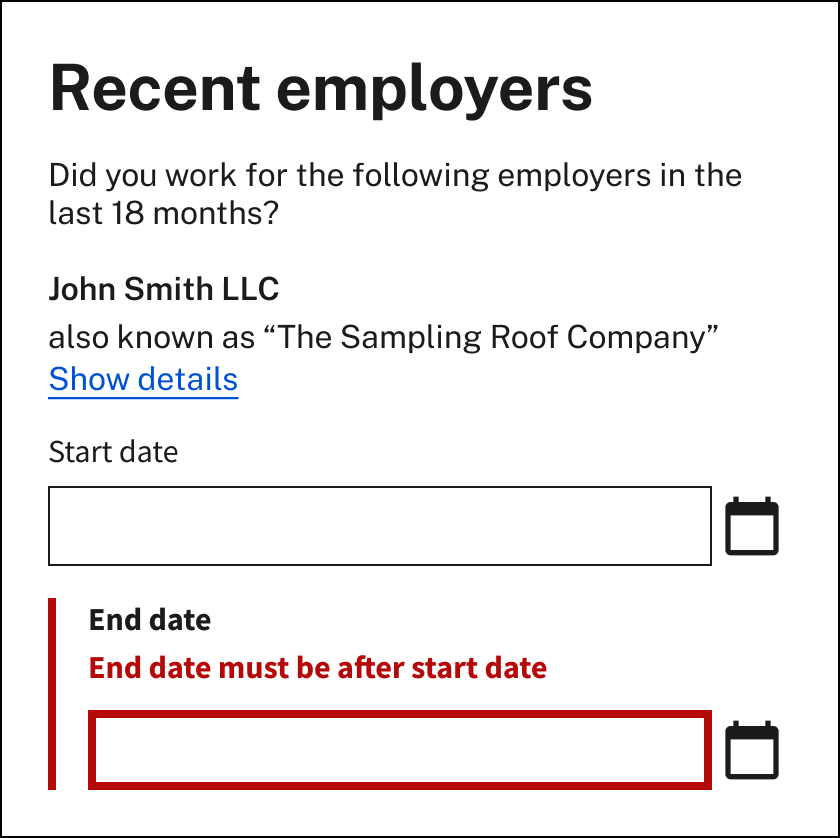
Due to the complexity of program rules and terminology, claimants often need additional help from state agency staff throughout the application. Help content that is provided to claimants in the context of where it is needed is called “contextual help.” This is different from Frequently Asked Questions (FAQs), articles, or claimant handbooks that are found outside of the UI application flow. Help content in the interface should be written in plain language and delivered when and where it is likely to be needed by the claimant. Help content should also be accessible on mobile devices and shouldn’t rely on a mouse hover interaction to be viewable. There are four different types of contextual help that can be effectively used in UI applications.
"Page lead” help text is found at the beginning of the page to guide the claimant in their interaction with that page overall.
Form label help text appears just below the question (often referred to as a form “label”) in online forms. This text should be extremely brief and effectively clarify or guide a claimant through a difficult or often misunderstood question.
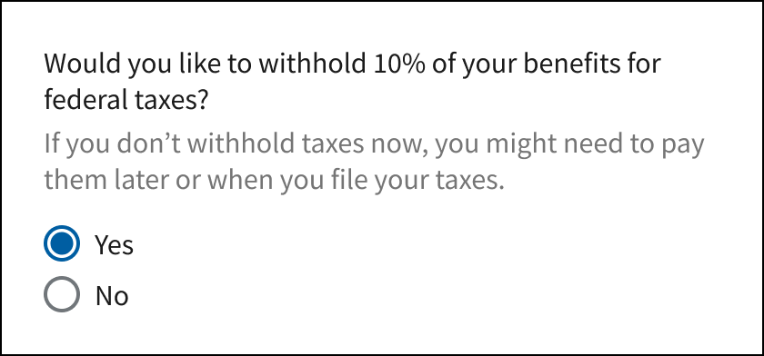
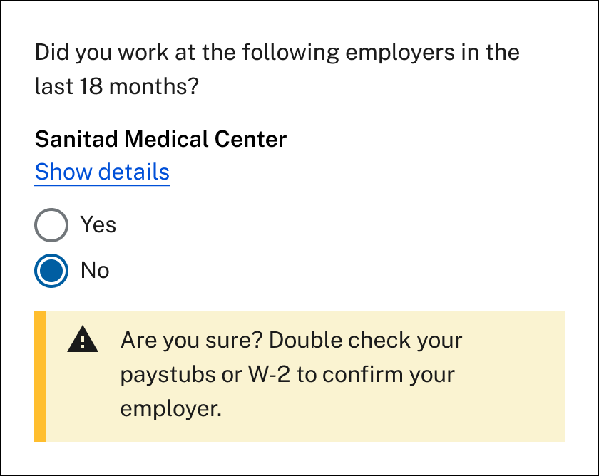
Conditional or consequential help text appears when a claimant interacts with the interface (for example, when they select a radio button). In UI applications, certain questions can lead to intensive manual interventions from state agency staff and delay claimant benefits. Conditional or consequential help seeks to provide the claimant information about the consequence of their action, or alert them to possible inaccuracies in their answers.
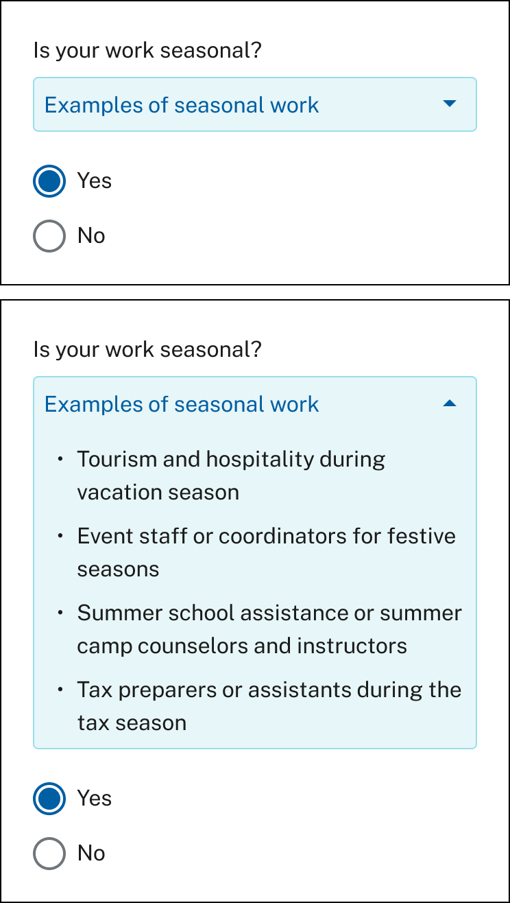
Help text reveal or disclosure help text is used when several lines of instructions or descriptions are needed to support claimants in providing accurate answers. Help text reveals or disclosures might include examples, definitions of terms, proactive answers to common questions, where claimants might find information requested, or clarifications of policy or process. Text should still be as brief as possible for easier comprehension and to avoid long scrolling interactions for claimants on mobile devices.
Show and save progress
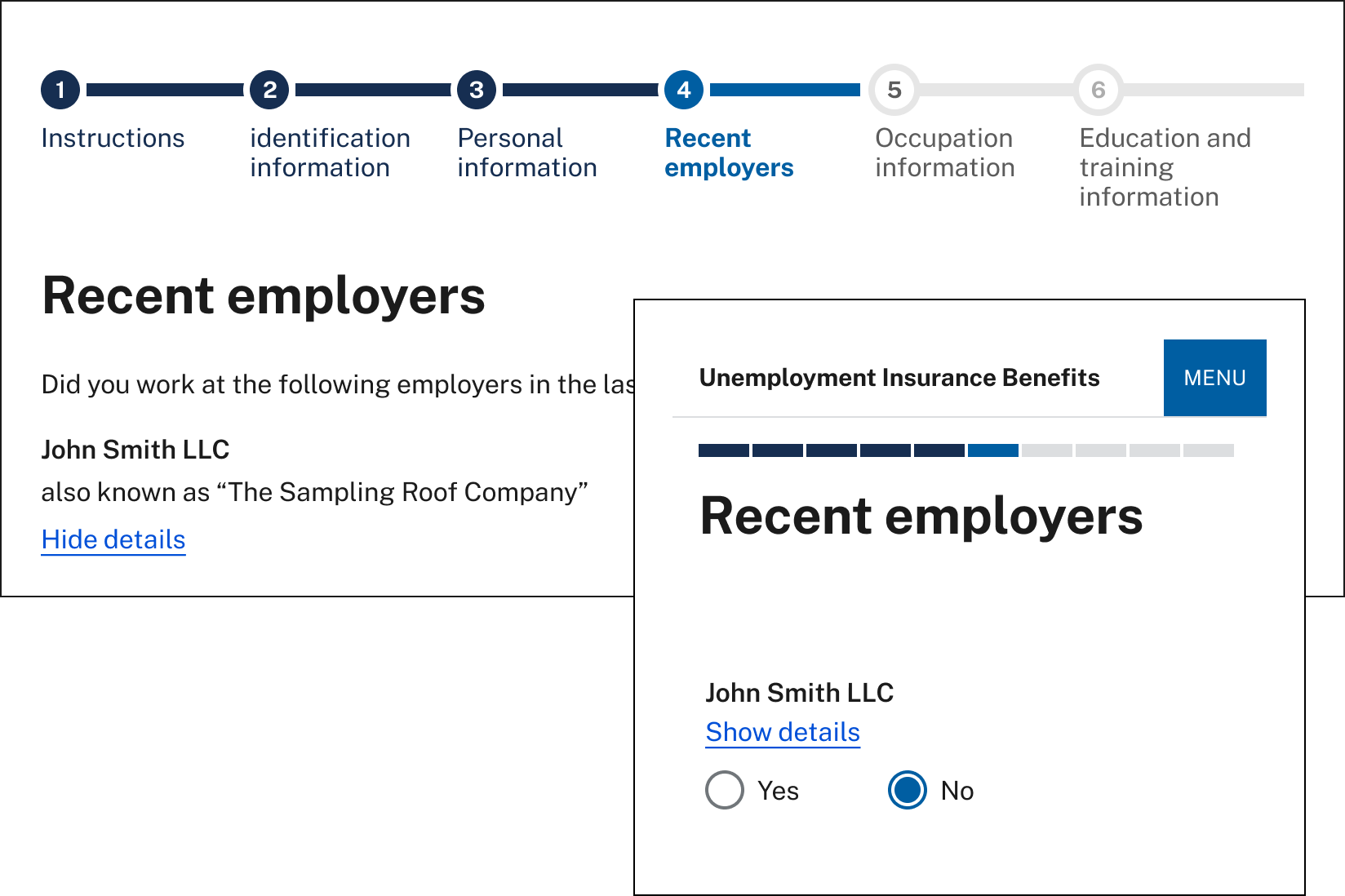
Show progress: Online UI applications require claimants to provide different categories of information – personal information, demographic information, wage information, and so on. Any online interaction that spans different topics can be disorienting for a user who may forget the context of a question, need to step away to collect documents, or to deal with a distraction. Online applications can help claimants stay on track by clearly showing their progress within an organized application.
Communicate further actions to take: Completing the initial UI application is likely the first step a claimant will take in a longer process that includes substantial follow-up communication. Because of this, the initial application should clearly communicate any next steps the claimant needs to take once the application is submitted, along with follow-up communications they can expect. This can be done via a confirmation page and/or other claims status functionality. To learn more about communicating claim status, review our claims status resource here.
Save progress: Online applications should save data entered by an authenticated claimant and be designed to minimize application session time outs by doing the following:
- Using the maximum inactive session time recommended by security guidelines such as the National Institute of Standards and Technology (NIST) guidelines
- Registering all interactions with an interface as activity including button clicks and selections, not just form page submissions
- Verifying the system is free of bugs that freeze or log out claimants
- Clearly communicating the inactive session time limit to the claimant
- Showing an alert when the session time is running out
Design for equitable access and inclusivity
Ensuring equity and access to benefits requires states to, at a minimum, adhere to applicable nondiscrimination laws such as Section 188 of the Workforce Innovation and Opportunity Act (WIOA) and to implement the regulations set forth at 29 CFR part 38. These laws apply to providing access to online applications for individuals in protected groups. Designing for equity and access can mitigate possible disparate impacts on these groups. Accessible and inclusive interfaces support a welcoming and usable CX, ensuring that all claimants can use and understand the application. These interfaces can improve claimant comprehension and trust, increase completion of applications, and encourage the timely maintenance of benefits, which all reduce administrative burden for staff. For more information about how improving the user experience can enhance equity and access to UI benefits, see USWDS’s inclusive design patterns and DOL’s Equity Access Toolkit.
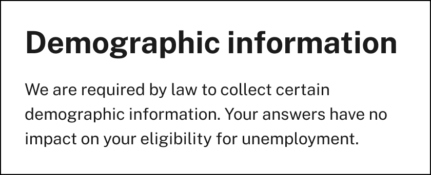
Clearly explain how information requested will be used by the agency to increase claimant comprehension and trust.
Some examples of equitable and inclusive practices in online applications include:
- Ensuring online processes and communications are consistent with modern accessibility laws and guidance, including WCAG 2.0 and 508 of the Rehabilitation Act. Resources to help build accessible systems and informational materials include the 18F Accessibility Guide and the U.S. Web Design System Accessibility Guide.
- Translating UI content and interfaces, consistent with federal law and guidance, into threshold languages (languages spoken by a significant number of the population eligible for or likely to encounter the UI program).
- Providing information and questions that consider the experiences of historically underserved populations through recognizable questions and helper content.
- Clearly communicating required information as well as how information will be used by the agency.
- Using plain language and a direct and respectful tone.
- Offering alternative access pathways (e.g., phone, in-person) and additional resources at points of significant claimant friction or drop off (e.g., account creation, identity verification, errors in claim filing).
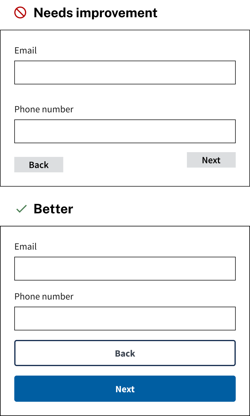
Make it usable on mobile
Claimants should be able to easily complete a UI application on any device. However, mobile devices have constraints that desktop computers don’t have, including smaller screen sizes, the absence of a dedicated keyboard and mouse (requiring claimants to use their fingers to interact with the screen), and limited internet connectivity or bandwidth. The US DOL has identified easy-to-follow layout, type and text, and form design improvements that can be used to make UI application more mobile friendly. Find more information in the mobile usability resource.
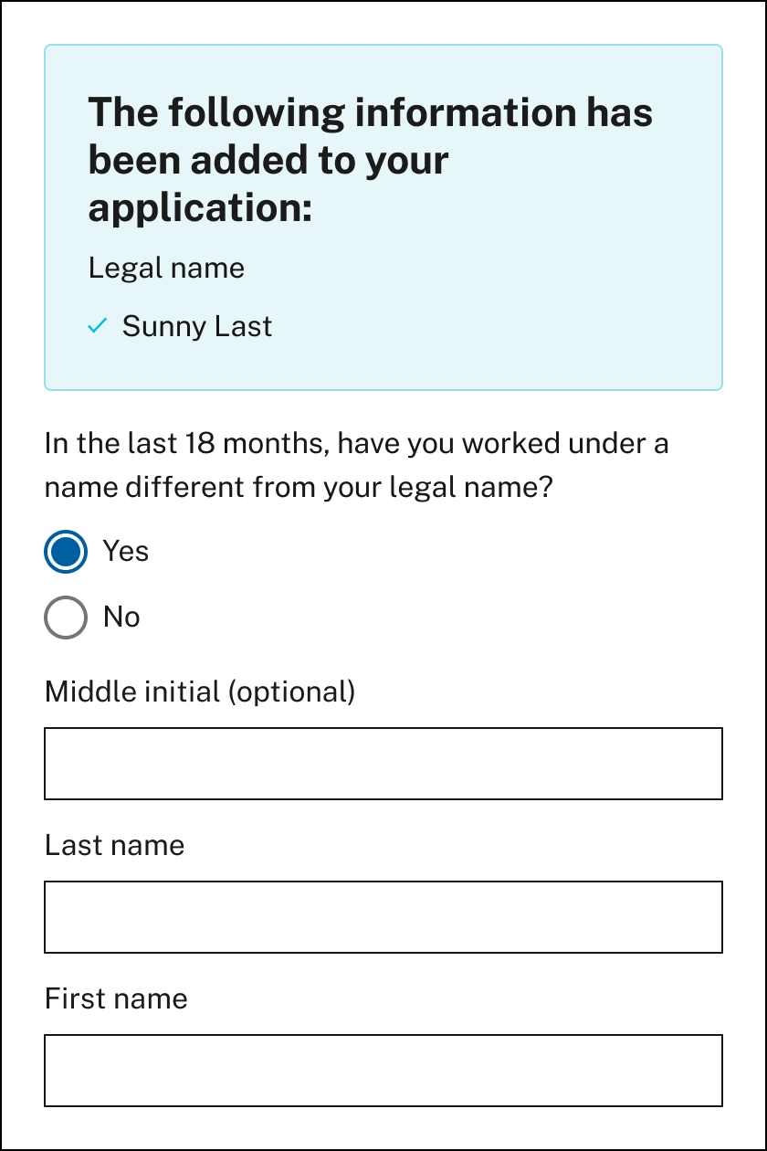
Pre-populate where possible
UI applications are often connected to other systems, enabling them to access certain data useful to processing claims. Where a claimant’s identity has been authenticated by a credentialed service provider and the UI application has secure access to claimant data this data can be used to prepopulate the application and reduce the amount of information a claimant must manually enter. Care should be taken to mask or partially mask any personally identifiable information displayed in the interface itself for claimants to reference or confirm.
Don’t ask the claimant to do calculations that the agency can do
Claimants often struggle when they are asked to quantify or calculate information before reporting it. They may experience stress, or make unintentional mistakes that state agency staff will need to resolve. To lessen the stress placed on claimants and increase the likelihood of obtaining accurate information from claimants, consider the following improvements:
- Do the calculation for the claimant: by using information already supplied and asking for confirmation instead of requiring manual calculation.
- Write clear and specific error messages: Provide error messages that tell claimants exactly what went wrong and how they can fix it.
- Prepare the claimant: Give the claimant clear directions or explanations on how to locate specific numbers, such as those found on their W-2 form. Explain how the information will be used to decrease claimant anxiety.
- Do research with claimants, including those who struggle with numbers: Conduct usability testing with claimants who experience dyscalculia, have math anxiety, low numeracy or have a difficult time recalling numbers.