
Dashboard overview
In this example dashboard, we’re assuming an audience of agency leadership stakeholders who want to know at a glance who is trying to submit initial unemployment insurance (UI) applications and what the customer experience is like for claimants from different demographic and geographic categories.
Given this audience and context, we selected three Customer Experience (CX) metrics (submission rate, submission time, and difficulty) and will show them for each of the categories. We will also show them alongside information about different access points, also known as “channels” that claimants use to submit their initial UI application (i.e., in-person, by telephone, on mobile devices, or on desktop computers).
A dashboard with these metrics could be part of a state’s overall approach to strengthening equitable access to UI. These metrics can provide states a stronger foundational understanding of the demographic variation in the initial application experience and potentially identify important access barriers.1 It can help answer such questions as:
- Is there a demographic commonality among individuals who are accessing the initial application through non-electronic channels versus electronic channels?
- How are initial applicants accessing the web-based platform? Is it through a mobile device or through a desktop computer?
- What are the demographic characteristics of each group? How is this access point affecting these groups’ access to benefits?
- Which individuals are struggling disproportionately in the initial application portion of the UI process?
In order to keep the dashboard succinct, we do not show details about where people drop off in the process (e.g., whether they complete the employment history section of the application), or how different populations access the initial application (e.g., in-person, on mobile web, or on desktop web). However, both could be featured in separate dashboards or serve as the basis of supplementary analysis that could deepen understanding of opportunities for strengthening access, particularly for groups the UI system has traditionally underserved.
This example dashboard does not show any real data but is intended to show possibilities as to the structure of a dashboard page and the type of data that may be included. They are annotated with numbers that correspond to numbered commentary below to explain the different pieces and dashboard best practices.
About the demographics
Below is a non-exhaustive list of demographic data elements a state UI agency could consider including in its dashboard. States are required to collect certain data points as part of administering the UI program, but delving deeper than the required reporting can increase awareness of opportunities to improve the claimant experience.
- Age
- Gender
- Education level
- Race and ethnicity
- Industry and occupation
- Disability (self-reported)
- Language preference
- Zip code
States are likely to collect these data elements in a variety of formats (e.g., state industry or occupation categories may differ). Depending on how a state builds the dashboard, having to show data for all the categories of any given data element could make the dashboard load slowly; moreover, it’s also a lot of information for a dashboard viewer to try to process and understand.
Importantly, a state may also want to consider not showing metric values for demographic categories with too few people (e.g., fewer than 100 people). When a category doesn’t have enough people in it, the value has a higher likelihood of being driven by random chance rather than being reflective of a pattern of user behavior.
Dashboard Commentary
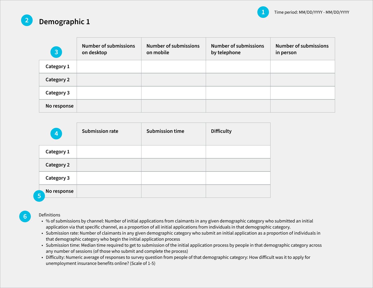
1. Show what time period the data is covering
This dashboard shows that the data is covering a specific one-week time period. It should get updated along with the rest of the dashboard’s data.
While this dashboard isn’t designed to be interactive, more advanced dashboards might let a viewer change the time window to see data for a different week, or for a longer time period.
Because some of the demographic categories may have relatively few claimants, you might consider a longer time view for this dashboard than for dashboards that are looking at the overall population.
2. Put thought into how you order the demographics
A rigorous equity dashboard will have a lot of data on it due to the range of demographic characteristics a state might be tracking.
The dashboard can show the metrics by any order of demographics. One thing to consider is a preliminary analysis to determine where the greatest demographic disparities are evident and put those on the top of the dashboard to be tracked most closely.
3. Submission channel for each demographic category
The first of the views for a given demographic category shows which channels people of a particular category use to submit their initial application – what percent of submissions from people of that demographic category are done in person, by telephone, on mobile web, or on desktop web? This way, you can see differences in how people of different backgrounds are accessing the initial application.
4. CX metrics for each demographic category
The second view for a given demographic shows the different CX metrics for people in the different categories of that demographic.
These metrics will help a state understand the experience of a particular population category, e.g.: of the people who identified as a particular demographic category, what percent of them completed and submitted the initial application? Of those in that category who completed and submitted the initial application, how long did it take them and how difficult did they find it?
5. Be sure to include all relevant categories
For the demographic data elements that are optional for claimants to respond to, show a “no response” category in addition to the other options. For demographics with many categories, there are ways to truncate or group the data for dashboarding purposes.
6. Include metric definitions on the dashboard itself
This will enable more people to understand the dashboard on their own. The definitions included in the example dashboard are for the metrics we suggest, but a state will need to update the definitions on their own dashboard to reflect the metrics displayed.
If there are any caveats or limitations to the data in the dashboard that the dashboard’s viewers should know about, the definitions section is a good place to put them.