
By: Alyssa Levitz - August 8, 2022
Improving your websites’ mobile usability is critical given that smartphones are the most accessible (and often only) way for unemployment insurance (UI) claimants to apply for benefits. According to a Pew Research study titled “Racial and ethnic differences in how people use mobile technology,” 25% of minority populations have smartphones as their only internet device.
While many states do have claimant applications and weekly certification processes that are usable on mobile devices, some states still need to make improvements. Using cascading style sheets (CSS) media queries, you can make huge improvements to the mobile usability of your site, often without upgrading your software stack or infrastructure. There are three key steps to this process:
- Define breakpoints to know the screen sizes that will trigger a special kind of rendering. There are typically two breakpoints, one between phones and tablets, and another between tablets and desktops. Check out the Media query example below.
- Define basic style classes for the content on the page, keeping in mind usability and accessibility.
- TIP: If you don’t want to reinvent the wheel, go with an existing design system like the U.S. Web Design System (Use a design system with built-in accessibility and mobile usability). Robust existing design systems will give you a good starting point for both breakpoints and styles, though you’ll almost certainly have to make additional changes to account for your branding and other styling rules that already exist on the page. You will do that by creating an additional design file (CSS) that overrides and adds onto the base design system.
- Decide whether you are going to add, remove, reorder, or change any content on the page when you update the styling of existing elements.
- TIP: While many possibilities exist, be judicious with the changes you want to make. For now, the goal is mobile usability. Don’t try to do everything at once, it might be better for your state to come up with a roadmap of what changes you’ll make in what order.
Below is an example of how New Jersey decided to improve the mobile experience of UI claimants without upgrading infrastructure:
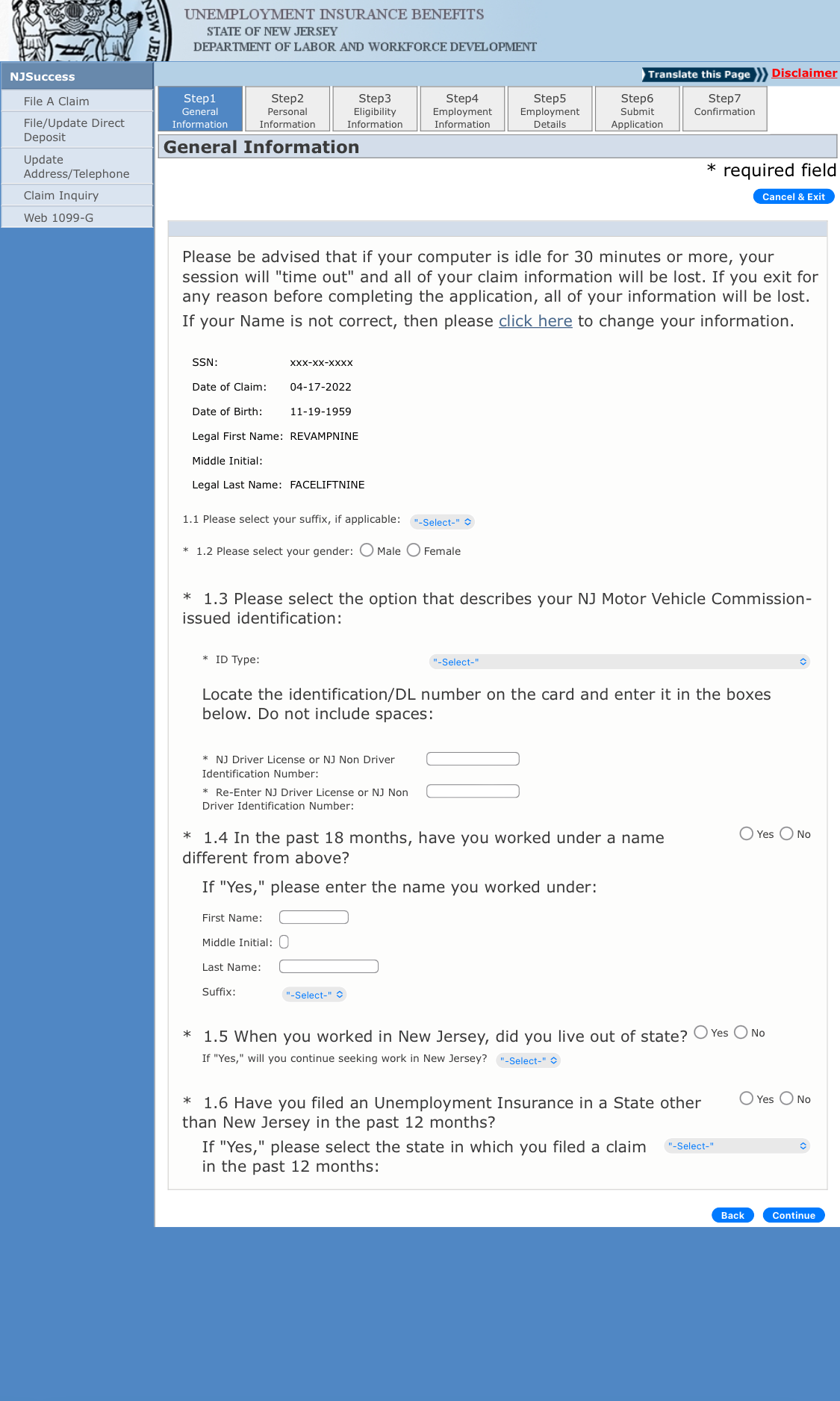
Needs improvement
Content-heavy page that doesn’t follow a hierarchical structure and with varied font sizes, making the page difficult to navigate and scan. Pinching to zoom in and out, and scrolling horizontally, are required to complete the form on a small device. Field labels and input fields placed side-by-side adds unnecessary complexity.
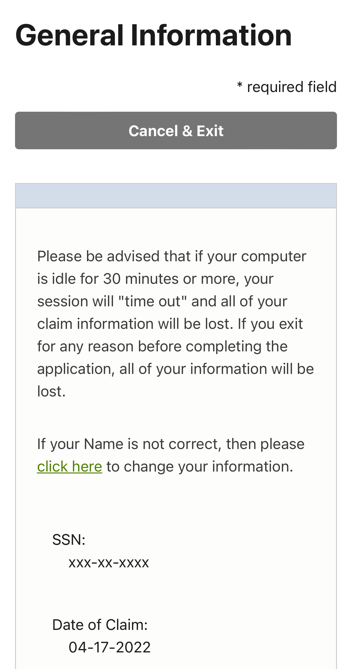
Better
Stacking and aligning the text and page elements, such as buttons and input fields, helps with readability and ease of interaction with the application. New Jersey accomplished this by changing just the front-end code of the page.
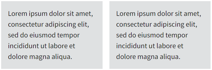
Media query example
The following code snippet shows a few sections of text aligned side-by-side on a page using the CSS flex display property. This works well for wide screens but appears too narrow on mobile.
<style>
  .container {
    display: flex;
    gap: 1rem;
  }
  .container div {
    background-color: #eee;
    padding: 1rem;
    flex-grow: 1;
  }
</style>
<div class="container">
  <div>
    Lorem ipsum dolor sit amet, consectetur adipiscing elit, sed do eiusmod
    tempor incididunt ut labore et dolore magna aliqua.
  </div>
  <div>
    Lorem ipsum dolor sit amet, consectetur adipiscing elit, sed do eiusmod
    tempor incididunt ut labore et dolore magna aliqua.
  </div>
</div>
To fix this, we can add a media query. The added code in the following snippet translates to "apply these styles if the viewport width is less than or equal to 480 pixels." In this case, we change the container from display: flex to display: block and add some margin around the container's children.
<style>
.container {
display: flex;
gap: 1rem;
}
.container div {
background-color: #eee;
padding: 1rem;
flex-grow: 1;
}
/* Added media query */
@media (max-width: 480px) {
.container {
display: block;
}
.container div {
margin: 1rem;
}
}
</style>
<div class="container">
<div>
Lorem ipsum dolor sit amet, consectetur adipiscing elit, sed do eiusmod
tempor incididunt ut labore et dolore magna aliqua.
</div>
<div>
Lorem ipsum dolor sit amet, consectetur adipiscing elit, sed do eiusmod
tempor incididunt ut labore et dolore magna aliqua.
</div>
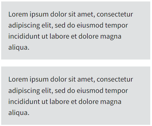
</div>With this change, when we cross the 480px breakpoint, our layout changes to be more mobile responsive. For the example below, the mobile version automatically stacks content vertically to be easy to read on mobile. The pseudo-Latin text (Lorem Ipsum) is only a placeholder to show visual arrangement of the text.
Desktop
Mobile

Interested in getting involved? Email the UI Modernization Team

Was this page helpful? Fill out a short survey