
Applicants need to understand questions on the unemployment insurance (UI) application to answer accurately. Clearer questions mean better understanding and fewer mistakes for everybody, regardless of reading level or English fluency. Arkansas, New Jersey, and U.S. Department of Labor collaborated with content strategist to develop the sample language and approaches described below, based on plain language best practices.
Define Complex Terms
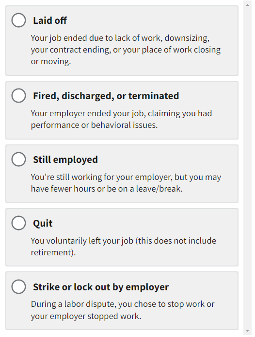
Many UI terms such as "laid off," "fired," and "quit," may have different nuances depending on the states and territories. Applicants need to understand UI terminology and concepts so they can make an accurate selection. If claimants don't understand a term, they might choose not to apply or they might submit an inaccurate response. This creates burdens not only for the applicants, but also for the state workforce agency staff who have to investigate and correct those errors.
When possible, provide short, clear definitions on the same page as the question being asked. Below is an example of providing definitions for a few of the options on the question about separation.
Note: This is not the complete list of separation options.
What We Learned from Testing
When shown definitions, applicants generally read this screen more carefully, and chose the correct answer, resulting in submissions that are easier and faster to process.
Use Simpler Terms When Possible
There are free tools and resources that can analyze web content for readability. Word processing applications and online tools can also assess the grade level of your website or form. Small changes can increase clarity and reduce errors in applications. Content should be around a 6th grade reading level (see UIPL 02-16).
.png)
A
Some states include various payment options (for example “debit card” and “direct deposit”). However, claimants may interpret “debit card” to mean their own debit card versus a pre-paid card. Claimants were not confused with “direct deposit.” Research participants responded well to this updated version of the question as it provides additional information and context.
| Before | After |
|---|---|
| Have you been employed in the past 18 months? | Have you had a job during the last 18 months? |
| Please select your sex | What is your sex? (Options: Female / Male) |
| Do you currently reside in the United States? | Do you currently live in the United States? |
| Please select your reason for separation from this employer | Why did your job end? |
What We Learned from Testing
The "After" options were well received in usability testing — in other words, participants had a greater comprehension rate for the simplified sentences.
Break Up Long Sentences
Previously, the attestation sentence before the signature caused confusion. Splitting this sentence into two sentences reduces the required reading level. Alternatively, bullets can break up long sentences that have multiple elements.
Before
Do you certify that your responses to the preceding questions are true, and that you are aware that the law imposes penalties for false answers?
.png)
After
I gave true answers to all questions. I know there may be legal punishments for giving false answers.
B
This sentence was previously long and difficult to understand. Multiple edits using the practices above were used to reduce confusion.
Use Active Voice
Whenever possible, write sentences using “active voice.”
Readers are more likely to understand sentences with active voice than those with passive voice. Active voice is straightforward, clear, and concise - essential for online writing. Just as importantly, it can help readers understand who’s responsible for taking what action.
Here's an example:
- Active voice: You'll need to contact your State Workforce Agency with any questions about the process.
- Passive voice: Your State Workforce Agency will need to be contacted with any questions about the process.
The first example makes it clear that “you” are responsible for contacting the State Workforce Agency. The second example is ambiguous — someone, somewhere will need to contact the State Workforce Agency.
Lengthy sentences with passive voice can be confusing. Keep your sentences short and clear using active voice as much as possible.
Include Helper Text
People applying for unemployment insurance often experience stress and anxiety. When faced with questions they don t know how to answer, applicants worry about their application being denied.
“Helper text” supplements existing information or questions on the application by giving more context so claimants can enter the most accurate information.
.PNG)
C
After reading this helper text, research participants better understood why demographic information was needed.
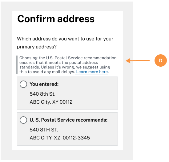
D
Helper text can guide users to a recommended choice.
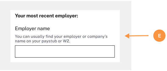
E
Helper text can provide a hint if the applicant is unsure where or how to find information.
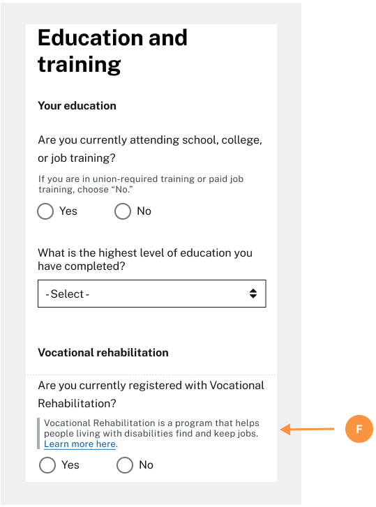
F
Add helper text to provide additional context, explanations, and examples to make the application process easier.
What We Learned from Testing
In usability testing, people who noticed the helper text generally found it easier to select the best option.
Interested in getting involved? Email the UI Modernization Team
Was this page helpful? Fill out a short survey